Edvancer's Knowledge Hub
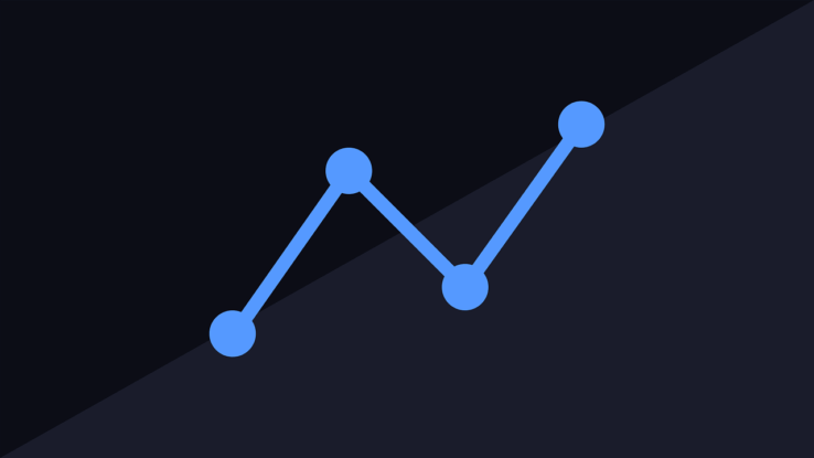
Advantages of using data visualization for businesses
One important attribute of competitive business is the ability to make decisions as fast as possible. But before a business can achieve that, business leaders should have access to data in real-time and interpret it accordingly.
Gathering information and the capacity to understand it is crucial for businesses. To detect business opportunities earlier than competitors, the business must be able to access, assess, understand and respond to information faster and more effectively than ever before.
The tools and strategies for data visualization can enable the business and its team to work on new strategies to significantly enhance their skills to grasp the data hiding in the layers of information. Below are the top five advantages that data visualization can provide to business owners.
Visualize the patterns and connections between operations and sales and marketing activities
Among the important advantages of data visualization is how it can enable business users to more easily detect relationships as they happen between sales and marketing performance and business operations. In the highly competitive nature of the business world, looking for these relationships within the data has never been crucial.
For instance, let’s say a business executive for a toy company is reading the monthly customer information. The executive can access the bar chart, which shows that the net promoter score of the business has decreased by three points in the past quarter in Japan. The report suggests that there is a concern with customer satisfaction in the country. However, the report lacks on insight to explain why the ratings got dipped.
By offering a more comprehensive report of the business as well as the operational dynamics, data visualization allows the leader to see that the recent events in Japan have affected the customer satisfaction. The capacity to make such connections will allow the business leader to determine the real cause of the concern and respond faster for resolution.
Make sense of data in new and more innovative ways
According to a research conducted by the University Of Pennsylvania School Of Medicine, our eyes can transfer information at about 10mbps, which is about the same speed as internet connection. However, many business reports are presented for business executives who may fail to understand the data because these are filled with plain charts and static tables that cannot supplement the information.
On the other hand, data visualization allows end users to absorb a large-scale information about business and operations. Effective visualization will allow business executives to identify relationships between multi-faceted data sets and offers better ways to make sense of data by using fewer charts, heat maps, and other helpful and relevant graphical representations.
Business that are using visual data are more capable of finding the information they need once they need it and can do so more effectively compared to their competitors who are not using data visualization.
According to market survey conducted by Aberdeen group in 2013, business managers who are using visual data tools have 28% more chance to find relevant information compared to their peers who are relying on dashboards and traditional reports. Furthermore, about 48% of business intelligence users are businesses who are using visual data can find information they need even without asking the help of their IT personnel.
Detect and respond on rising trends faster
The scale of information that businesses are capable of capturing about their customers as well as market trends can offer business executives with relevant insights into new opportunities to do business and increase revenue as long as they can spot on opportunities in the layers of data. By using effective data visualization, business executives can detect sudden changes in customer behaviors as well as market conditions across several data sets much faster.
For instance, marketing executives for a grocery chain could use data visualization to see that customers are willing to spend more as the economy improves and they are also more interested in buying organic items that are more expensive compared to regular items.
A more comprehensive analysis of consumer behavior and other data sets suggest a rising opportunity for the store to launch a special section of organic products. Business insights like this can enable the organization to respond to this new business opportunity ahead of its competitors.
Tell a story
Another benefit of using data visualization for business is its capacity to tell a story that everyone in the business and its stakeholders can relate to.
For example, business executives for a manufacturing company who are monitoring crucial indicators like net profit margin and EBITDA. They can only view the part of the story pertaining to the current conditions of the business through a bar chart, which may not show that the business already produced 2% revenue growth for the previous month. This report doesn’t show which specific categories are increasing or decreasing as well as the probable reasons why.
A heat map can show which product categories are performing or underperforming, and will enable business executives to consider the data to figure out the factors that are shaping sales. The data could reveal that cosmetics are not performing, but that higher-income segment comprises the majority of sales. The business can use this insight to target marketing efforts to this customer segment to increase conversion rates as well as profit growth of this category.
Directly interact and control data
One of the most important advantages of data visualization is its ability to provide actionable business insights. Unlike static charts and tables, which you can view only, data visualization will allow users to control and interact with data.
For instance, traditional business report can inform a business owner of an appliance company that sales for coffee makers for July are down. But the report cannot inform the business owner why the sales of coffee makers are down of if specific brands or price are doing better when compared to others. Furthermore, the data contained in the report might represent the situation days or weeks ago, so the data is not accurate and does not signify the current trend.
Through real-time predictive analytics integrated with data visualization, the business owner can view current sales figures and check why specific brands are not performing well, and the possible reasons that revenues are lagging behind – for instance, sales campaigns launched by competitors.
The business owner can identify the best action according to the analytical models that can be developed specifically for the business.

Share this on

Follow us on
Manu Jeevan
Manu Jeevan is a self-taught data scientist and loves to explain data science concepts in simple terms. You can connect with him on LinkedIn, or email him at manu@bigdataexaminer.com.
Latest posts by Manu Jeevan (see all)
- Python IDEs for Data Science: Top 5 - January 19, 2019
- The 5 exciting machine learning, data science and big data trends for 2019 - January 19, 2019
- A/B Testing Made Simple – Part 2 - October 30, 2018
Follow us on
Free Data Science & AI Starter Course