Edvancer's Knowledge Hub
Step-by-step guide to execute Linear Regression in R

One of the most popular and frequently used techniques in statistics is linear regression where you predict a real-valued output based on an input value. Technically, linear regression is a statistical technique to analyze/predict the linear relationship between a dependent variable and one or more independent variables.
Let’s say you want to predict the price of a house, the price is the dependent variable and factors like size of the house, locality, and season of purchase might act as independent variables. This is because the price depends on other variables.
R comes with many default data sets and it can be seen using MASS library.
Install.packages(“MASS”)
Library(MASS)
Data()
This will give you a list of available data sets using which you can get can a clear idea of linear regression problems.
Analysing a default data set in R
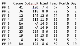
In this post, I will use a default data set called “airquality” data. The data set has various air quality parameters in New York city.
These are the parameters in the data set:
 Attach () function makes the data available to the R search path.
Summary function gives you the range, quartiles, median and mean for numerical variables and table with frequencies for categorical variables.
summary(airquality)
## Ozone Solar.R Wind Temp
## Min. : 1.00 Min. : 7.0 Min. : 1.700 Min. :56.00
## 1st Qu.: 18.00 1st Qu.:115.8 1st Qu.: 7.400 1st Qu.:72.00
## Median : 31.50 Median :205.0 Median : 9.700 Median :79.00
## Mean : 42.13 Mean :185.9 Mean : 9.958 Mean :77.88
## 3rd Qu.: 63.25 3rd Qu.:258.8 3rd Qu.:11.500 3rd Qu.:85.00
## Max. :168.00 Max. :334.0 Max. :20.700 Max. :97.00
## NA’s :37 NA’s :7
## Month Day
## Min. :5.000 Min. : 1.0
## 1st Qu.:6.000 1st Qu.: 8.0
## Median :7.000 Median :16.0
## Mean :6.993 Mean :15.8
## 3rd Qu.:8.000 3rd Qu.:23.0
## Max. :9.000 Max. :31.0
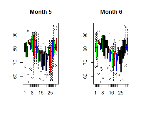
Data visualization
I use a boxplot to visualize the daily temperature for month 5, 6, 7, 8 and 9.
month5=subset(airquality,Month=5)
month6=subset(airquality,Month=6)
month7=subset(airquality,Month=7)
month8=subset(airquality,Month=8)
month9=subset(airquality,Month=9)
par(mfrow = c(1,2)) # 3 rows and 2 columns
boxplot((month5$Temp~airquality$Day),main=”Month 5″,col=rainbow(3))
boxplot((month6$Temp~airquality$Day),main=”Month 6″,col=rainbow(3))
We can drop one of the two variables that has high correlation but if we have a good knowledge about data then we can form a new variable by taking the difference of two. For example, if ‘expenditure and income’ as variables have high correlation then we can create a new variable called ‘savings’ by taking the difference of ‘expenditure’ and ‘income’. We can do this only if we have domain knowledge.
Let’s see the effect of multicollinearity (without dropping a parameter) on our model.
Model_lm1=lm(Temp~.,data=airquality)
summary(Model_lm1)
##
## Call:
## lm(formula = Temp ~ ., data = airquality)
##
## Residuals:
## Min 1Q Median 3Q Max
## -20.110 -4.048 0.859 4.034 12.840
##
## Coefficients:
## Estimate Std. Error t value Pr(>|t|)
## (Intercept) 57.251830 4.502218 12.716 < 2e-16 ***
## Ozone 0.165275 0.023878 6.922 3.66e-10 ***
## Solar.R 0.010818 0.006985 1.549 0.124
## Wind -0.174326 0.212292 -0.821 0.413
## Month 2.042460 0.409431 4.989 2.42e-06 ***
## Day -0.089187 0.067714 -1.317 0.191
## —
## Signif. codes: 0 ‘***’ 0.001 ‘**’ 0.01 ‘*’ 0.05 ‘.’ 0.1 ‘ ‘ 1
##
## Residual standard error: 6.159 on 105 degrees of freedom
## (42 observations deleted due to missingness)
## Multiple R-squared: 0.6013, Adjusted R-squared: 0.5824
## F-statistic: 31.68 on 5 and 105 DF, p-value: < 2.2e-16
Before we interpret the results, I am going to the tune the model for a low AIC value.
The Akaike Information Criterion (AIC) is a measure of the relative quality of statistical models for a given set of data. Given a collection of models for the data, AIC estimates the quality of each model, relative to each of the other models. Hence, AIC provides a means for model selection.
You can tune the model for a low AIC in two ways:
1) By eliminating some less significant variables and re-running the model
2) Using a ‘Step’ function in R. The step function runs all the possible parameters and checks the lowest value.
I am going to use the second method here.
Model_lm_best=step(Model_lm1)
## Start: AIC=409.4
## Temp ~ Ozone + Solar.R + Wind + Month + Day
##
## Df Sum of Sq RSS AIC
## – Wind 1 25.58 4008.2 408.11
## – Day 1 65.80 4048.5 409.22
## <none> 3982.7 409.40
## – Solar.R 1 90.96 4073.6 409.91
## – Month 1 943.90 4926.6 431.01
## – Ozone 1 1817.27 5799.9 449.12
##
## Step: AIC=408.11
## Temp ~ Ozone + Solar.R + Month + Day
##
## Df Sum of Sq RSS AIC
## – Day 1 71.5 4079.8 408.07
## <none> 4008.2 408.11
## – Solar.R 1 82.1 4090.3 408.36
## – Month 1 997.2 5005.5 430.77
## – Ozone 1 3242.4 7250.6 471.90
##
## Step: AIC=408.07
## Temp ~ Ozone + Solar.R + Month
##
## Df Sum of Sq RSS AIC
## <none> 4079.8 408.07
## – Solar.R 1 92.1 4171.9 408.55
## – Month 1 1006.3 5086.1 430.55
## – Ozone 1 3225.5 7305.3 470.74
summary(Model_lm_best)
##
## Call:
## lm(formula = Temp ~ Ozone + Solar.R + Month, data = airquality)
##
## Residuals:
## Min 1Q Median 3Q Max
## -21.2300 -4.3645 0.6438 4.1479 11.3866
##
## Coefficients:
## Estimate Std. Error t value Pr(>|t|)
## (Intercept) 53.262897 3.268761 16.295 < 2e-16 ***
## Ozone 0.176503 0.019190 9.198 3.34e-15 ***
## Solar.R 0.010807 0.006953 1.554 0.123
## Month 2.092793 0.407364 5.137 1.26e-06 ***
## —
## Signif. codes: 0 ‘***’ 0.001 ‘**’ 0.01 ‘*’ 0.05 ‘.’ 0.1 ‘ ‘ 1
##
## Residual standard error: 6.175 on 107 degrees of freedom
## (42 observations deleted due to missingness)
## Multiple R-squared: 0.5916, Adjusted R-squared: 0.5802
## F-statistic: 51.67 on 3 and 107 DF, p-value: < 2.2e-16
This summary gives coefficients of dependent variables and error term with the significance level (confidence level). The highlighted line in the result shows how to read the level of significance. A three asterisks means 99.99% significant (check the corresponding value. If it is less than 0.01 means variable is 99.99% significant).
The R square and adjusted R square values defines how much variance of the dependent variable is explained by the model and the rest is explained by the error term. Hence, higher the R square or adjusted R square better the model.
Adjusted R square is a better indicator of explained variance because it considers only important variables and extra variables are deliberately dropped by adjusted R square. In other words, adjusted R square penalizes the inclusion of many variables in the model for the sake of high percentage of variance explained.
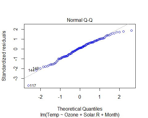
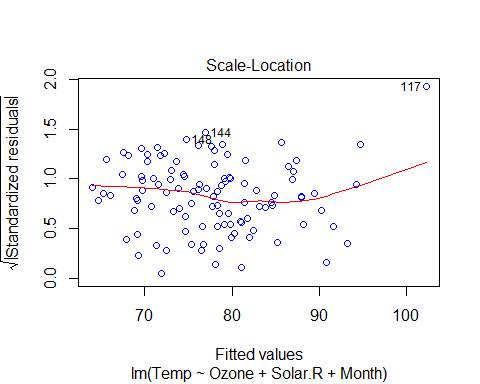
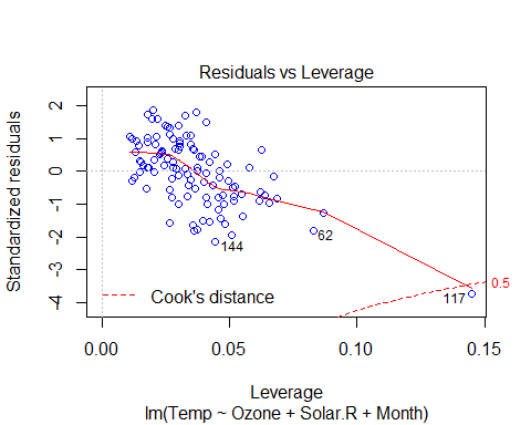
plot(Model_lm_best,col=”blue”)
VIF and Multicollinearity
Variable Inflation factor is an important parameter regarding value of coefficient of determination (R2). If two independent variables are highly correlated then it inflates the model’s variance (estimated error).
To deal with this, we can check VIF of the model before and after dropping one of the two highly correlated variables.
Formula for VIF:
VIF(k)= 1/1+Rk^2
Where R2 is the value obtained by regressing the kth predictor on the remaining predictors.
So to calculate VIF, we make model for each independent variable and consider all other variables as predictors. Then we calculate VIF for each variable. Whenever VIF is high, it means that set of variables have high correlation with the selected variable.
We will use an R library called ‘fmsb’ to calculate VIF.
So we can check VIF for our final linear model.
Library(fmsb)
Model_lm1=lm(Temp~ Ozone+Solar.R+Month,data=airquality)
VIF(lm(Month ~ Ozone+Solar.R,data=airquality))
[1] 1.039042
VIF(lm(Ozone ~ Solar.R+Month, data=airquality))
[1] 1.137975
VIF(lm(Solar.R ~ Ozone +Month, data=airquality))
[1] 1.118629
As a general rule, VIF < 5 is acceptable (VIF = 1 means there is no multicollinearity), and VIF > 5 is not acceptable and we need to check our model.
In our example, VIF < 5 and hence there is no need of any additional verification needed.
Interpretation of results
Basic assumptions of linear regression:
To measure the quality of the model there are many ways and residual sum of squares is the most common one.
There are many ways to measure the quality of a model, but residual sum of squares is the most common one.
Residual sum of squares attempts to make a ‘line of best fit’ in the scattered data points so that the line has least error with respect to the actual data points.
If Y is the actual data point and Y’ is the predicted value by the equation, then the error is Y-Y’. But this has a bias towards ‘sign’ because when you sum up the error positive and negative values would cancel each other so the resultant error would be less than the actual value. To overcome this, a general method is to take square which serves two purposes:
1) Cancel out the effect of signs
2) Penalize the error in prediction
Prediction
To make a prediction, let’s build a data frame for new values of Solar.R, Wind and Ozone.
Solar.R=185.93 Wind=9.96 Ozone=42.12
Solar.R=185.93
Wind=9.96
Ozone=42.12
Month=9
new_data=data.frame(Solar.R,Wind,Ozone,Month)
new_data
## Solar.R Wind Ozone Month
## 1 185.93 9.96 42.12 9
pred_temp=predict(Model_lm_best,newdata=new_data)
## [1] “the predicted temperature is: 81.54”
Conclusion
The regression algorithm assumes that the data is normally distributed and there is a linear relation between dependent and independent variables. It is a good mathematical model to analyze relationship and significance of various variables.
Attach () function makes the data available to the R search path.
Summary function gives you the range, quartiles, median and mean for numerical variables and table with frequencies for categorical variables.
summary(airquality)
## Ozone Solar.R Wind Temp
## Min. : 1.00 Min. : 7.0 Min. : 1.700 Min. :56.00
## 1st Qu.: 18.00 1st Qu.:115.8 1st Qu.: 7.400 1st Qu.:72.00
## Median : 31.50 Median :205.0 Median : 9.700 Median :79.00
## Mean : 42.13 Mean :185.9 Mean : 9.958 Mean :77.88
## 3rd Qu.: 63.25 3rd Qu.:258.8 3rd Qu.:11.500 3rd Qu.:85.00
## Max. :168.00 Max. :334.0 Max. :20.700 Max. :97.00
## NA’s :37 NA’s :7
## Month Day
## Min. :5.000 Min. : 1.0
## 1st Qu.:6.000 1st Qu.: 8.0
## Median :7.000 Median :16.0
## Mean :6.993 Mean :15.8
## 3rd Qu.:8.000 3rd Qu.:23.0
## Max. :9.000 Max. :31.0
Data visualization
I use a boxplot to visualize the daily temperature for month 5, 6, 7, 8 and 9.
month5=subset(airquality,Month=5)
month6=subset(airquality,Month=6)
month7=subset(airquality,Month=7)
month8=subset(airquality,Month=8)
month9=subset(airquality,Month=9)
par(mfrow = c(1,2)) # 3 rows and 2 columns
boxplot((month5$Temp~airquality$Day),main=”Month 5″,col=rainbow(3))
boxplot((month6$Temp~airquality$Day),main=”Month 6″,col=rainbow(3))
We can drop one of the two variables that has high correlation but if we have a good knowledge about data then we can form a new variable by taking the difference of two. For example, if ‘expenditure and income’ as variables have high correlation then we can create a new variable called ‘savings’ by taking the difference of ‘expenditure’ and ‘income’. We can do this only if we have domain knowledge.
Let’s see the effect of multicollinearity (without dropping a parameter) on our model.
Model_lm1=lm(Temp~.,data=airquality)
summary(Model_lm1)
##
## Call:
## lm(formula = Temp ~ ., data = airquality)
##
## Residuals:
## Min 1Q Median 3Q Max
## -20.110 -4.048 0.859 4.034 12.840
##
## Coefficients:
## Estimate Std. Error t value Pr(>|t|)
## (Intercept) 57.251830 4.502218 12.716 < 2e-16 ***
## Ozone 0.165275 0.023878 6.922 3.66e-10 ***
## Solar.R 0.010818 0.006985 1.549 0.124
## Wind -0.174326 0.212292 -0.821 0.413
## Month 2.042460 0.409431 4.989 2.42e-06 ***
## Day -0.089187 0.067714 -1.317 0.191
## —
## Signif. codes: 0 ‘***’ 0.001 ‘**’ 0.01 ‘*’ 0.05 ‘.’ 0.1 ‘ ‘ 1
##
## Residual standard error: 6.159 on 105 degrees of freedom
## (42 observations deleted due to missingness)
## Multiple R-squared: 0.6013, Adjusted R-squared: 0.5824
## F-statistic: 31.68 on 5 and 105 DF, p-value: < 2.2e-16
Before we interpret the results, I am going to the tune the model for a low AIC value.
The Akaike Information Criterion (AIC) is a measure of the relative quality of statistical models for a given set of data. Given a collection of models for the data, AIC estimates the quality of each model, relative to each of the other models. Hence, AIC provides a means for model selection.
You can tune the model for a low AIC in two ways:
1) By eliminating some less significant variables and re-running the model
2) Using a ‘Step’ function in R. The step function runs all the possible parameters and checks the lowest value.
I am going to use the second method here.
Model_lm_best=step(Model_lm1)
## Start: AIC=409.4
## Temp ~ Ozone + Solar.R + Wind + Month + Day
##
## Df Sum of Sq RSS AIC
## – Wind 1 25.58 4008.2 408.11
## – Day 1 65.80 4048.5 409.22
## <none> 3982.7 409.40
## – Solar.R 1 90.96 4073.6 409.91
## – Month 1 943.90 4926.6 431.01
## – Ozone 1 1817.27 5799.9 449.12
##
## Step: AIC=408.11
## Temp ~ Ozone + Solar.R + Month + Day
##
## Df Sum of Sq RSS AIC
## – Day 1 71.5 4079.8 408.07
## <none> 4008.2 408.11
## – Solar.R 1 82.1 4090.3 408.36
## – Month 1 997.2 5005.5 430.77
## – Ozone 1 3242.4 7250.6 471.90
##
## Step: AIC=408.07
## Temp ~ Ozone + Solar.R + Month
##
## Df Sum of Sq RSS AIC
## <none> 4079.8 408.07
## – Solar.R 1 92.1 4171.9 408.55
## – Month 1 1006.3 5086.1 430.55
## – Ozone 1 3225.5 7305.3 470.74
summary(Model_lm_best)
##
## Call:
## lm(formula = Temp ~ Ozone + Solar.R + Month, data = airquality)
##
## Residuals:
## Min 1Q Median 3Q Max
## -21.2300 -4.3645 0.6438 4.1479 11.3866
##
## Coefficients:
## Estimate Std. Error t value Pr(>|t|)
## (Intercept) 53.262897 3.268761 16.295 < 2e-16 ***
## Ozone 0.176503 0.019190 9.198 3.34e-15 ***
## Solar.R 0.010807 0.006953 1.554 0.123
## Month 2.092793 0.407364 5.137 1.26e-06 ***
## —
## Signif. codes: 0 ‘***’ 0.001 ‘**’ 0.01 ‘*’ 0.05 ‘.’ 0.1 ‘ ‘ 1
##
## Residual standard error: 6.175 on 107 degrees of freedom
## (42 observations deleted due to missingness)
## Multiple R-squared: 0.5916, Adjusted R-squared: 0.5802
## F-statistic: 51.67 on 3 and 107 DF, p-value: < 2.2e-16
This summary gives coefficients of dependent variables and error term with the significance level (confidence level). The highlighted line in the result shows how to read the level of significance. A three asterisks means 99.99% significant (check the corresponding value. If it is less than 0.01 means variable is 99.99% significant).
The R square and adjusted R square values defines how much variance of the dependent variable is explained by the model and the rest is explained by the error term. Hence, higher the R square or adjusted R square better the model.
Adjusted R square is a better indicator of explained variance because it considers only important variables and extra variables are deliberately dropped by adjusted R square. In other words, adjusted R square penalizes the inclusion of many variables in the model for the sake of high percentage of variance explained.
plot(Model_lm_best,col=”blue”)
VIF and Multicollinearity
Variable Inflation factor is an important parameter regarding value of coefficient of determination (R2). If two independent variables are highly correlated then it inflates the model’s variance (estimated error).
To deal with this, we can check VIF of the model before and after dropping one of the two highly correlated variables.
Formula for VIF:
VIF(k)= 1/1+Rk^2
Where R2 is the value obtained by regressing the kth predictor on the remaining predictors.
So to calculate VIF, we make model for each independent variable and consider all other variables as predictors. Then we calculate VIF for each variable. Whenever VIF is high, it means that set of variables have high correlation with the selected variable.
We will use an R library called ‘fmsb’ to calculate VIF.
So we can check VIF for our final linear model.
Library(fmsb)
Model_lm1=lm(Temp~ Ozone+Solar.R+Month,data=airquality)
VIF(lm(Month ~ Ozone+Solar.R,data=airquality))
[1] 1.039042
VIF(lm(Ozone ~ Solar.R+Month, data=airquality))
[1] 1.137975
VIF(lm(Solar.R ~ Ozone +Month, data=airquality))
[1] 1.118629
As a general rule, VIF < 5 is acceptable (VIF = 1 means there is no multicollinearity), and VIF > 5 is not acceptable and we need to check our model.
In our example, VIF < 5 and hence there is no need of any additional verification needed.
Interpretation of results
Basic assumptions of linear regression:
To measure the quality of the model there are many ways and residual sum of squares is the most common one.
There are many ways to measure the quality of a model, but residual sum of squares is the most common one.
Residual sum of squares attempts to make a ‘line of best fit’ in the scattered data points so that the line has least error with respect to the actual data points.
If Y is the actual data point and Y’ is the predicted value by the equation, then the error is Y-Y’. But this has a bias towards ‘sign’ because when you sum up the error positive and negative values would cancel each other so the resultant error would be less than the actual value. To overcome this, a general method is to take square which serves two purposes:
1) Cancel out the effect of signs
2) Penalize the error in prediction
Prediction
To make a prediction, let’s build a data frame for new values of Solar.R, Wind and Ozone.
Solar.R=185.93 Wind=9.96 Ozone=42.12
Solar.R=185.93
Wind=9.96
Ozone=42.12
Month=9
new_data=data.frame(Solar.R,Wind,Ozone,Month)
new_data
## Solar.R Wind Ozone Month
## 1 185.93 9.96 42.12 9
pred_temp=predict(Model_lm_best,newdata=new_data)
## [1] “the predicted temperature is: 81.54”
Conclusion
The regression algorithm assumes that the data is normally distributed and there is a linear relation between dependent and independent variables. It is a good mathematical model to analyze relationship and significance of various variables.

Share this on
Follow us on
- Daily temperature from May to August
- Solar radiation data
- Ozone data
- Wind data
 Attach () function makes the data available to the R search path.
Summary function gives you the range, quartiles, median and mean for numerical variables and table with frequencies for categorical variables.
summary(airquality)
## Ozone Solar.R Wind Temp
## Min. : 1.00 Min. : 7.0 Min. : 1.700 Min. :56.00
## 1st Qu.: 18.00 1st Qu.:115.8 1st Qu.: 7.400 1st Qu.:72.00
## Median : 31.50 Median :205.0 Median : 9.700 Median :79.00
## Mean : 42.13 Mean :185.9 Mean : 9.958 Mean :77.88
## 3rd Qu.: 63.25 3rd Qu.:258.8 3rd Qu.:11.500 3rd Qu.:85.00
## Max. :168.00 Max. :334.0 Max. :20.700 Max. :97.00
## NA’s :37 NA’s :7
## Month Day
## Min. :5.000 Min. : 1.0
## 1st Qu.:6.000 1st Qu.: 8.0
## Median :7.000 Median :16.0
## Mean :6.993 Mean :15.8
## 3rd Qu.:8.000 3rd Qu.:23.0
## Max. :9.000 Max. :31.0
Data visualization
I use a boxplot to visualize the daily temperature for month 5, 6, 7, 8 and 9.
month5=subset(airquality,Month=5)
month6=subset(airquality,Month=6)
month7=subset(airquality,Month=7)
month8=subset(airquality,Month=8)
month9=subset(airquality,Month=9)
par(mfrow = c(1,2)) # 3 rows and 2 columns
boxplot((month5$Temp~airquality$Day),main=”Month 5″,col=rainbow(3))
boxplot((month6$Temp~airquality$Day),main=”Month 6″,col=rainbow(3))
Attach () function makes the data available to the R search path.
Summary function gives you the range, quartiles, median and mean for numerical variables and table with frequencies for categorical variables.
summary(airquality)
## Ozone Solar.R Wind Temp
## Min. : 1.00 Min. : 7.0 Min. : 1.700 Min. :56.00
## 1st Qu.: 18.00 1st Qu.:115.8 1st Qu.: 7.400 1st Qu.:72.00
## Median : 31.50 Median :205.0 Median : 9.700 Median :79.00
## Mean : 42.13 Mean :185.9 Mean : 9.958 Mean :77.88
## 3rd Qu.: 63.25 3rd Qu.:258.8 3rd Qu.:11.500 3rd Qu.:85.00
## Max. :168.00 Max. :334.0 Max. :20.700 Max. :97.00
## NA’s :37 NA’s :7
## Month Day
## Min. :5.000 Min. : 1.0
## 1st Qu.:6.000 1st Qu.: 8.0
## Median :7.000 Median :16.0
## Mean :6.993 Mean :15.8
## 3rd Qu.:8.000 3rd Qu.:23.0
## Max. :9.000 Max. :31.0
Data visualization
I use a boxplot to visualize the daily temperature for month 5, 6, 7, 8 and 9.
month5=subset(airquality,Month=5)
month6=subset(airquality,Month=6)
month7=subset(airquality,Month=7)
month8=subset(airquality,Month=8)
month9=subset(airquality,Month=9)
par(mfrow = c(1,2)) # 3 rows and 2 columns
boxplot((month5$Temp~airquality$Day),main=”Month 5″,col=rainbow(3))
boxplot((month6$Temp~airquality$Day),main=”Month 6″,col=rainbow(3))
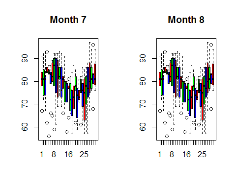
boxplot((month7$Temp~airquality$Day),main=“Month 7”,col=rainbow(3)) boxplot((month8$Temp~airquality$Day),main=“Month 8”,col=rainbow(3))
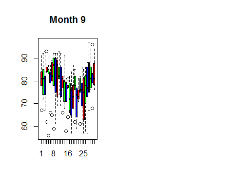
boxplot((month9$Temp~airquality$Day),main=”Month 9″,col=rainbow(3
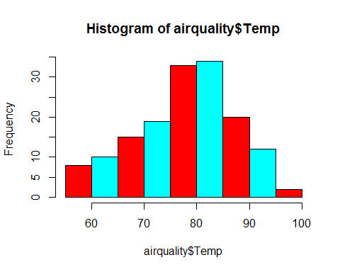
hist(airquality$Temp,col=rainbow(2))
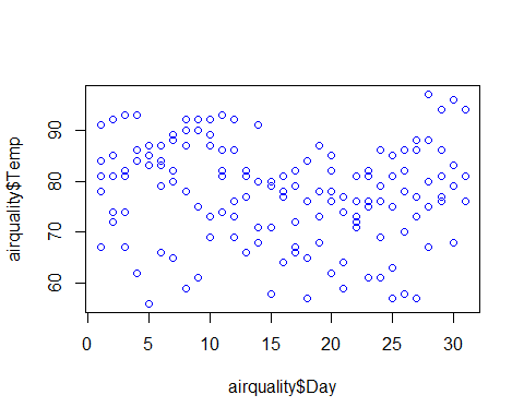
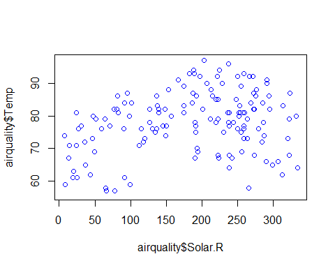
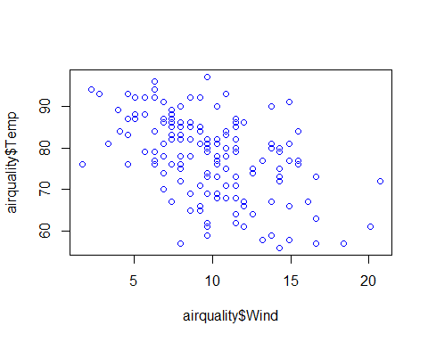
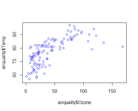
plot(airquality$Temp~airquality$Day+airquality$Solar.R+airquality$Wind+airquality$Ozone,col=”blue”)
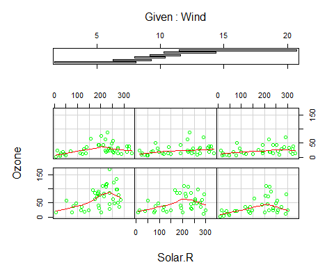
coplot(Ozone~Solar.R|Wind,panel=panel.smooth,airquality,col =”green” )
It’s time to execute to Linear Regression on our data set
I use lm function to run a linear regression on our data set. The function lm fits a linear model to the data where Temperature (dependent variable) is on the left hand side separated by a ~ from the independent variables. Data preparation: The input data needs be processed before we use them in our algorithm. This means, deleting rows that has no values, checking correlation and outliers. While building the model, R inherently takes care of the null values, and drops the rows where the data is missing. This eventually results in data loss. There are different methods to deal with data loss like imputing mean for numerical variables and mode for categorical variables. Another method is to replace null values with any value way larger than other values in the range. For e.g. we can replace a null value with -1 when the variable is age. Since age cannot be negative, R considers the negative value as an outlier while building the model. We can use the following command to find column wise count of null values in the data. sapply(airquality,function(x){sum(is.na(x))}) ## Ozone Solar.R Wind Temp Month Day ## 37 7 0 0 0 0 You can see that there are missing values in Ozone and Solar.R. We can drop those rows but that would result in data loss since there are just 153 rows in our data, dropping 37 would be almost a 20% loss. Hence, we will replace the null values with mean (since both of the variables are numerical). airquality$Ozone[is.na(airquality$Ozone)]=mean(airquality$Ozone,na.rm=T) airquality$Solar.R[is.na(airquality$Solar.R)]=mean(airquality$Solar.R,na.rm=T) sapply(airquality,function(x){sum(is.na(x))}) ## Ozone Solar.R Wind Temp Month Day ## 0 0 0 0 0 0 Now, let’s check the correlation between independent variables. We use corrplot library to visualize the correlation between variables. library(corrplot) o=corrplot(cor(airquality),method=’number’) # this method can be changed try using method=’circle’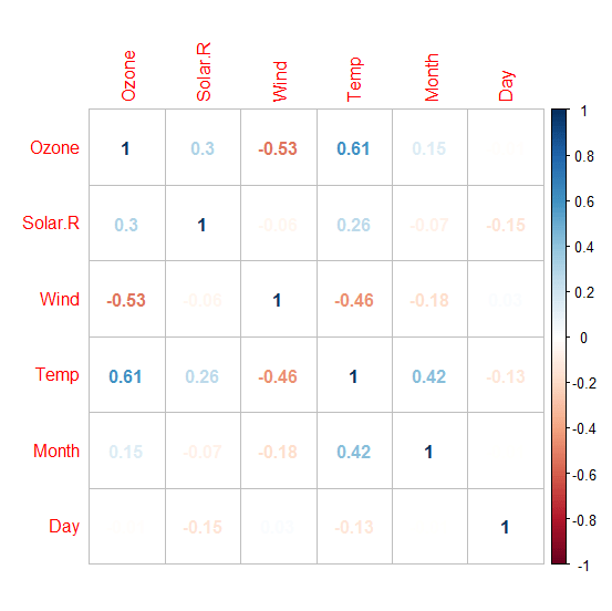 We can drop one of the two variables that has high correlation but if we have a good knowledge about data then we can form a new variable by taking the difference of two. For example, if ‘expenditure and income’ as variables have high correlation then we can create a new variable called ‘savings’ by taking the difference of ‘expenditure’ and ‘income’. We can do this only if we have domain knowledge.
Let’s see the effect of multicollinearity (without dropping a parameter) on our model.
Model_lm1=lm(Temp~.,data=airquality)
summary(Model_lm1)
##
## Call:
## lm(formula = Temp ~ ., data = airquality)
##
## Residuals:
## Min 1Q Median 3Q Max
## -20.110 -4.048 0.859 4.034 12.840
##
## Coefficients:
## Estimate Std. Error t value Pr(>|t|)
## (Intercept) 57.251830 4.502218 12.716 < 2e-16 ***
## Ozone 0.165275 0.023878 6.922 3.66e-10 ***
## Solar.R 0.010818 0.006985 1.549 0.124
## Wind -0.174326 0.212292 -0.821 0.413
## Month 2.042460 0.409431 4.989 2.42e-06 ***
## Day -0.089187 0.067714 -1.317 0.191
## —
## Signif. codes: 0 ‘***’ 0.001 ‘**’ 0.01 ‘*’ 0.05 ‘.’ 0.1 ‘ ‘ 1
##
## Residual standard error: 6.159 on 105 degrees of freedom
## (42 observations deleted due to missingness)
## Multiple R-squared: 0.6013, Adjusted R-squared: 0.5824
## F-statistic: 31.68 on 5 and 105 DF, p-value: < 2.2e-16
Before we interpret the results, I am going to the tune the model for a low AIC value.
The Akaike Information Criterion (AIC) is a measure of the relative quality of statistical models for a given set of data. Given a collection of models for the data, AIC estimates the quality of each model, relative to each of the other models. Hence, AIC provides a means for model selection.
You can tune the model for a low AIC in two ways:
1) By eliminating some less significant variables and re-running the model
2) Using a ‘Step’ function in R. The step function runs all the possible parameters and checks the lowest value.
I am going to use the second method here.
Model_lm_best=step(Model_lm1)
## Start: AIC=409.4
## Temp ~ Ozone + Solar.R + Wind + Month + Day
##
## Df Sum of Sq RSS AIC
## – Wind 1 25.58 4008.2 408.11
## – Day 1 65.80 4048.5 409.22
## <none> 3982.7 409.40
## – Solar.R 1 90.96 4073.6 409.91
## – Month 1 943.90 4926.6 431.01
## – Ozone 1 1817.27 5799.9 449.12
##
## Step: AIC=408.11
## Temp ~ Ozone + Solar.R + Month + Day
##
## Df Sum of Sq RSS AIC
## – Day 1 71.5 4079.8 408.07
## <none> 4008.2 408.11
## – Solar.R 1 82.1 4090.3 408.36
## – Month 1 997.2 5005.5 430.77
## – Ozone 1 3242.4 7250.6 471.90
##
## Step: AIC=408.07
## Temp ~ Ozone + Solar.R + Month
##
## Df Sum of Sq RSS AIC
## <none> 4079.8 408.07
## – Solar.R 1 92.1 4171.9 408.55
## – Month 1 1006.3 5086.1 430.55
## – Ozone 1 3225.5 7305.3 470.74
summary(Model_lm_best)
##
## Call:
## lm(formula = Temp ~ Ozone + Solar.R + Month, data = airquality)
##
## Residuals:
## Min 1Q Median 3Q Max
## -21.2300 -4.3645 0.6438 4.1479 11.3866
##
## Coefficients:
## Estimate Std. Error t value Pr(>|t|)
## (Intercept) 53.262897 3.268761 16.295 < 2e-16 ***
## Ozone 0.176503 0.019190 9.198 3.34e-15 ***
## Solar.R 0.010807 0.006953 1.554 0.123
## Month 2.092793 0.407364 5.137 1.26e-06 ***
## —
## Signif. codes: 0 ‘***’ 0.001 ‘**’ 0.01 ‘*’ 0.05 ‘.’ 0.1 ‘ ‘ 1
##
## Residual standard error: 6.175 on 107 degrees of freedom
## (42 observations deleted due to missingness)
## Multiple R-squared: 0.5916, Adjusted R-squared: 0.5802
## F-statistic: 51.67 on 3 and 107 DF, p-value: < 2.2e-16
This summary gives coefficients of dependent variables and error term with the significance level (confidence level). The highlighted line in the result shows how to read the level of significance. A three asterisks means 99.99% significant (check the corresponding value. If it is less than 0.01 means variable is 99.99% significant).
The R square and adjusted R square values defines how much variance of the dependent variable is explained by the model and the rest is explained by the error term. Hence, higher the R square or adjusted R square better the model.
Adjusted R square is a better indicator of explained variance because it considers only important variables and extra variables are deliberately dropped by adjusted R square. In other words, adjusted R square penalizes the inclusion of many variables in the model for the sake of high percentage of variance explained.
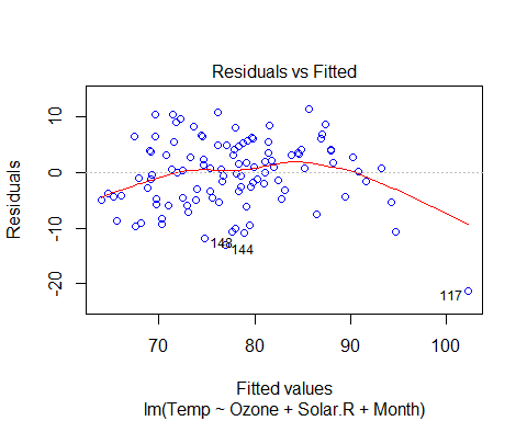
plot(Model_lm_best,col=”blue”)
We can drop one of the two variables that has high correlation but if we have a good knowledge about data then we can form a new variable by taking the difference of two. For example, if ‘expenditure and income’ as variables have high correlation then we can create a new variable called ‘savings’ by taking the difference of ‘expenditure’ and ‘income’. We can do this only if we have domain knowledge.
Let’s see the effect of multicollinearity (without dropping a parameter) on our model.
Model_lm1=lm(Temp~.,data=airquality)
summary(Model_lm1)
##
## Call:
## lm(formula = Temp ~ ., data = airquality)
##
## Residuals:
## Min 1Q Median 3Q Max
## -20.110 -4.048 0.859 4.034 12.840
##
## Coefficients:
## Estimate Std. Error t value Pr(>|t|)
## (Intercept) 57.251830 4.502218 12.716 < 2e-16 ***
## Ozone 0.165275 0.023878 6.922 3.66e-10 ***
## Solar.R 0.010818 0.006985 1.549 0.124
## Wind -0.174326 0.212292 -0.821 0.413
## Month 2.042460 0.409431 4.989 2.42e-06 ***
## Day -0.089187 0.067714 -1.317 0.191
## —
## Signif. codes: 0 ‘***’ 0.001 ‘**’ 0.01 ‘*’ 0.05 ‘.’ 0.1 ‘ ‘ 1
##
## Residual standard error: 6.159 on 105 degrees of freedom
## (42 observations deleted due to missingness)
## Multiple R-squared: 0.6013, Adjusted R-squared: 0.5824
## F-statistic: 31.68 on 5 and 105 DF, p-value: < 2.2e-16
Before we interpret the results, I am going to the tune the model for a low AIC value.
The Akaike Information Criterion (AIC) is a measure of the relative quality of statistical models for a given set of data. Given a collection of models for the data, AIC estimates the quality of each model, relative to each of the other models. Hence, AIC provides a means for model selection.
You can tune the model for a low AIC in two ways:
1) By eliminating some less significant variables and re-running the model
2) Using a ‘Step’ function in R. The step function runs all the possible parameters and checks the lowest value.
I am going to use the second method here.
Model_lm_best=step(Model_lm1)
## Start: AIC=409.4
## Temp ~ Ozone + Solar.R + Wind + Month + Day
##
## Df Sum of Sq RSS AIC
## – Wind 1 25.58 4008.2 408.11
## – Day 1 65.80 4048.5 409.22
## <none> 3982.7 409.40
## – Solar.R 1 90.96 4073.6 409.91
## – Month 1 943.90 4926.6 431.01
## – Ozone 1 1817.27 5799.9 449.12
##
## Step: AIC=408.11
## Temp ~ Ozone + Solar.R + Month + Day
##
## Df Sum of Sq RSS AIC
## – Day 1 71.5 4079.8 408.07
## <none> 4008.2 408.11
## – Solar.R 1 82.1 4090.3 408.36
## – Month 1 997.2 5005.5 430.77
## – Ozone 1 3242.4 7250.6 471.90
##
## Step: AIC=408.07
## Temp ~ Ozone + Solar.R + Month
##
## Df Sum of Sq RSS AIC
## <none> 4079.8 408.07
## – Solar.R 1 92.1 4171.9 408.55
## – Month 1 1006.3 5086.1 430.55
## – Ozone 1 3225.5 7305.3 470.74
summary(Model_lm_best)
##
## Call:
## lm(formula = Temp ~ Ozone + Solar.R + Month, data = airquality)
##
## Residuals:
## Min 1Q Median 3Q Max
## -21.2300 -4.3645 0.6438 4.1479 11.3866
##
## Coefficients:
## Estimate Std. Error t value Pr(>|t|)
## (Intercept) 53.262897 3.268761 16.295 < 2e-16 ***
## Ozone 0.176503 0.019190 9.198 3.34e-15 ***
## Solar.R 0.010807 0.006953 1.554 0.123
## Month 2.092793 0.407364 5.137 1.26e-06 ***
## —
## Signif. codes: 0 ‘***’ 0.001 ‘**’ 0.01 ‘*’ 0.05 ‘.’ 0.1 ‘ ‘ 1
##
## Residual standard error: 6.175 on 107 degrees of freedom
## (42 observations deleted due to missingness)
## Multiple R-squared: 0.5916, Adjusted R-squared: 0.5802
## F-statistic: 51.67 on 3 and 107 DF, p-value: < 2.2e-16
This summary gives coefficients of dependent variables and error term with the significance level (confidence level). The highlighted line in the result shows how to read the level of significance. A three asterisks means 99.99% significant (check the corresponding value. If it is less than 0.01 means variable is 99.99% significant).
The R square and adjusted R square values defines how much variance of the dependent variable is explained by the model and the rest is explained by the error term. Hence, higher the R square or adjusted R square better the model.
Adjusted R square is a better indicator of explained variance because it considers only important variables and extra variables are deliberately dropped by adjusted R square. In other words, adjusted R square penalizes the inclusion of many variables in the model for the sake of high percentage of variance explained.
plot(Model_lm_best,col=”blue”)
 VIF and Multicollinearity
Variable Inflation factor is an important parameter regarding value of coefficient of determination (R2). If two independent variables are highly correlated then it inflates the model’s variance (estimated error).
To deal with this, we can check VIF of the model before and after dropping one of the two highly correlated variables.
Formula for VIF:
VIF(k)= 1/1+Rk^2
Where R2 is the value obtained by regressing the kth predictor on the remaining predictors.
So to calculate VIF, we make model for each independent variable and consider all other variables as predictors. Then we calculate VIF for each variable. Whenever VIF is high, it means that set of variables have high correlation with the selected variable.
We will use an R library called ‘fmsb’ to calculate VIF.
So we can check VIF for our final linear model.
Library(fmsb)
Model_lm1=lm(Temp~ Ozone+Solar.R+Month,data=airquality)
VIF(lm(Month ~ Ozone+Solar.R,data=airquality))
[1] 1.039042
VIF(lm(Ozone ~ Solar.R+Month, data=airquality))
[1] 1.137975
VIF(lm(Solar.R ~ Ozone +Month, data=airquality))
[1] 1.118629
As a general rule, VIF < 5 is acceptable (VIF = 1 means there is no multicollinearity), and VIF > 5 is not acceptable and we need to check our model.
In our example, VIF < 5 and hence there is no need of any additional verification needed.
Interpretation of results
Basic assumptions of linear regression:
VIF and Multicollinearity
Variable Inflation factor is an important parameter regarding value of coefficient of determination (R2). If two independent variables are highly correlated then it inflates the model’s variance (estimated error).
To deal with this, we can check VIF of the model before and after dropping one of the two highly correlated variables.
Formula for VIF:
VIF(k)= 1/1+Rk^2
Where R2 is the value obtained by regressing the kth predictor on the remaining predictors.
So to calculate VIF, we make model for each independent variable and consider all other variables as predictors. Then we calculate VIF for each variable. Whenever VIF is high, it means that set of variables have high correlation with the selected variable.
We will use an R library called ‘fmsb’ to calculate VIF.
So we can check VIF for our final linear model.
Library(fmsb)
Model_lm1=lm(Temp~ Ozone+Solar.R+Month,data=airquality)
VIF(lm(Month ~ Ozone+Solar.R,data=airquality))
[1] 1.039042
VIF(lm(Ozone ~ Solar.R+Month, data=airquality))
[1] 1.137975
VIF(lm(Solar.R ~ Ozone +Month, data=airquality))
[1] 1.118629
As a general rule, VIF < 5 is acceptable (VIF = 1 means there is no multicollinearity), and VIF > 5 is not acceptable and we need to check our model.
In our example, VIF < 5 and hence there is no need of any additional verification needed.
Interpretation of results
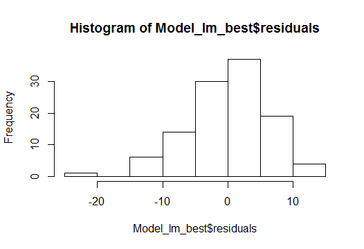
Basic assumptions of linear regression:
- Linear relationship between variables
- Normal distribution of residuals
- No or little multi-collinearity: we have seen this using VIF
- Homoscedasticity: Variance across the regression line should be uniform
 To measure the quality of the model there are many ways and residual sum of squares is the most common one.
There are many ways to measure the quality of a model, but residual sum of squares is the most common one.
Residual sum of squares attempts to make a ‘line of best fit’ in the scattered data points so that the line has least error with respect to the actual data points.
If Y is the actual data point and Y’ is the predicted value by the equation, then the error is Y-Y’. But this has a bias towards ‘sign’ because when you sum up the error positive and negative values would cancel each other so the resultant error would be less than the actual value. To overcome this, a general method is to take square which serves two purposes:
1) Cancel out the effect of signs
2) Penalize the error in prediction
Prediction
To make a prediction, let’s build a data frame for new values of Solar.R, Wind and Ozone.
Solar.R=185.93 Wind=9.96 Ozone=42.12
Solar.R=185.93
Wind=9.96
Ozone=42.12
Month=9
new_data=data.frame(Solar.R,Wind,Ozone,Month)
new_data
## Solar.R Wind Ozone Month
## 1 185.93 9.96 42.12 9
pred_temp=predict(Model_lm_best,newdata=new_data)
## [1] “the predicted temperature is: 81.54”
Conclusion
The regression algorithm assumes that the data is normally distributed and there is a linear relation between dependent and independent variables. It is a good mathematical model to analyze relationship and significance of various variables.
To measure the quality of the model there are many ways and residual sum of squares is the most common one.
There are many ways to measure the quality of a model, but residual sum of squares is the most common one.
Residual sum of squares attempts to make a ‘line of best fit’ in the scattered data points so that the line has least error with respect to the actual data points.
If Y is the actual data point and Y’ is the predicted value by the equation, then the error is Y-Y’. But this has a bias towards ‘sign’ because when you sum up the error positive and negative values would cancel each other so the resultant error would be less than the actual value. To overcome this, a general method is to take square which serves two purposes:
1) Cancel out the effect of signs
2) Penalize the error in prediction
Prediction
To make a prediction, let’s build a data frame for new values of Solar.R, Wind and Ozone.
Solar.R=185.93 Wind=9.96 Ozone=42.12
Solar.R=185.93
Wind=9.96
Ozone=42.12
Month=9
new_data=data.frame(Solar.R,Wind,Ozone,Month)
new_data
## Solar.R Wind Ozone Month
## 1 185.93 9.96 42.12 9
pred_temp=predict(Model_lm_best,newdata=new_data)
## [1] “the predicted temperature is: 81.54”
Conclusion
The regression algorithm assumes that the data is normally distributed and there is a linear relation between dependent and independent variables. It is a good mathematical model to analyze relationship and significance of various variables.
Manu Jeevan
Manu Jeevan is a self-taught data scientist and loves to explain data science concepts in simple terms. You can connect with him on LinkedIn, or email him at manu@bigdataexaminer.com.
Latest posts by Manu Jeevan (see all)
- Python IDEs for Data Science: Top 5 - January 19, 2019
- The 5 exciting machine learning, data science and big data trends for 2019 - January 19, 2019
- A/B Testing Made Simple – Part 2 - October 30, 2018
Follow us on
Free Data Science & AI Starter Course